SaaS landing page examples: 5 pages worth copying
Five SaaS landing page examples (Plausible, Tally, Cal.com, Raycast, Buttondown), what each does well, the patterns they share and a structure for your own page.

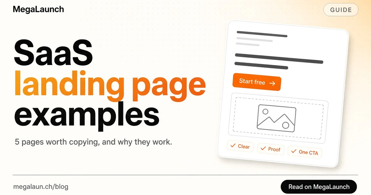
A SaaS landing page has one job: help the right visitor understand what your product does and take the next step, usually a signup or a trial. The best ones are not the most beautiful. They are the clearest. This guide breaks down five SaaS landing page examples worth studying, the patterns they share, and a section-by-section structure you can use for your own page before launch.
In this article10
What a SaaS landing page needs to do
A landing page is the page a visitor lands on after clicking a link, an ad or a launch listing. For a SaaS product, it usually has to answer five questions in order:
- What is it? One sentence a stranger understands.
- Is it for me? The audience or use case, stated plainly.
- Why this one? What makes it better than the alternative the visitor already uses.
- Can I trust it? Proof: customers, numbers, reviews, security.
- What do I do now? One clear call to action.
Every example below answers these questions, just with different emphasis. Note that marketing sites change often; the descriptions reflect the pages as they were in November 2026.
1. Plausible: position against the incumbent
Plausible Analytics describes itself in its headline as an easy to use and privacy-friendly Google Analytics alternative. That one line does a lot of work. It names the category through the product everyone already knows, and it states the two reasons to switch: simplicity and privacy.
The page then backs each claim with short, concrete benefit blocks: a simple dashboard on a single page, a lightweight script that does not hurt page speed, no cookie banner required, open source code and EU hosting. It also includes comparison pages against the tools visitors are likely to evaluate.
What to copy: if your buyers already use a well-known tool, name it. "An X alternative for Y" is often clearer than a clever invented category.
2. Tally: remove the risk from the first step
Tally opens with "The simplest way to create forms", then removes every objection to trying it: the main button is "Create a free form", with "No signup required" right next to it. Further down, the page repeats its strongest differentiator, unlimited forms and submissions for free within fair use, because free plans with tight limits are the main frustration of its audience.
The page shows the product working like a text document instead of describing features in the abstract.
What to copy: find the biggest reason people hesitate to try your product, and answer it directly next to the call to action. "No credit card", "free plan" or "takes two minutes" are only useful if they are true and specific.
3. Cal.com: show the product in the hero
Cal.com puts a working booking interface in its hero, next to the headline "Where people find the time to meet". Visitors see an actual booking page with durations, a calendar and time slots before reading a single feature list. Just below, one line sums up the problem it solves: finding a time took a week of emails, now it is one link.
The signup options are right in the hero, with "No credit card required" underneath, and the page ends with a frequently asked questions section that handles objections in the visitor's own words.
What to copy: a real screenshot or a small interactive demo of your core workflow beats an abstract illustration. Pair it with a before-and-after sentence about the problem.
4. Raycast: lead with the feeling, prove with details
Raycast uses a short, memorable headline, "Your shortcut to everything", and a second line about not feeling like you are wasting time. It then turns emotional promises into specific proof: fast, keyboard-first, personal and reliable, with a crash-free rate stated as a number, and a section titled "There's an extension for that" showing integrations by category.
The download button appears early and again throughout the page, with system requirements stated right under it so nobody downloads something that will not run.
What to copy: a short emotional headline works when it is immediately followed by concrete proof. If you claim speed or reliability, put a number on it.
5. Buttondown: speak to a specific pain
Buttondown targets people who have already been burned by other newsletter tools. Its page talks about platforms that shut down, raise fees or pile on features nobody wants, and positions Buttondown as the last email platform you will switch to. A customer quote about still being happy with the choice years later supports exactly that promise.
What to copy: if your best customers are switchers, describe their frustration better than they can. Choose testimonials that prove your main promise, not generic praise.
The patterns they share
Across these SaaS landing page examples, a few rules repeat:
- The headline names the outcome or the category, not the technology.
- The product is visible early, through a screenshot, a demo or an interactive element.
- One primary call to action, repeated down the page, with the risk reducer next to it.
- Proof is specific: a number, a named customer, a quote that matches the promise.
- Objections are answered on the page, often in an FAQ near the bottom.
- The copy is short. Each section makes one point.
A landing page structure you can reuse
If you are building your first page, this order works for most SaaS products:
- Hero: headline, one-line subtitle, primary button, risk reducer, product screenshot.
- Problem: two or three sentences on the pain, in the customer's words.
- How it works: three steps or three benefit blocks, each with a visual.
- Proof: logos, testimonials, numbers or a short case study.
- Comparison: why you instead of the usual alternative.
- Pricing or a link to it, with a free plan or trial if you have one.
- FAQ: the five questions you hear most in sales or support.
- Final call to action.
Your headline and subtitle carry most of the weight, so test several. Our tagline examples can help, and the value proposition canvas helps you find the benefit worth leading with. If the product is not live yet, start with a coming soon page that collects emails, then grow it into a full landing page.
Before you launch
Check the page on a phone, measure load time, make sure the main button works without errors, and set up analytics so you can see where visitors drop off. Then send it traffic: ask early users for feedback, share it where your audience gathers, and list your product on MegaLaunch so makers and early adopters can find it on launch day.
Frequently asked questions
What should a SaaS landing page include?
A clear headline and subtitle, one primary call to action, a product screenshot or demo, a short problem statement, three key benefits, specific proof such as customers or numbers, pricing or a link to it, and an FAQ.
How long should a SaaS landing page be?
Long enough to answer the questions a visitor has before signing up, and no longer. Simple self-serve products can convert with a short page; more expensive or complex products need more proof and explanation.
What makes a good SaaS landing page headline?
It says what the product does or which outcome it delivers, in words the customer uses. Naming a known alternative, as in "an X alternative for Y", often works well.
Do I need a landing page before launch?
Yes. Even a simple coming soon page that explains the product and collects emails lets you build a list and test your message before launch day.
Sources
 @matthias_mrc
Put it into practice. Launch your product.
A permanent page, a followed link to your site, and makers who vote for what they like.
- Free with a link back to MegaLaunch
- Premium: $14.99 one-time, no backlink needed
Done for you
We submit your product to 100+ dofollow directories.
From one brief, with a report for every directory. No badge needed on your site.


From$99one-time
See the plans