Pricing page examples: 5 SaaS pages and what they get right
Pricing page examples from Notion, Linear, Supabase, Basecamp and Stripe: the patterns they share, a pricing page checklist for a new SaaS, common mistakes and how to test your page.

A pricing page is where interest turns into a decision. Visitors arrive with one question, "what will this cost me and which plan is mine?", and they leave quickly if the answer is hard to find. This guide breaks down pricing page examples from well-known SaaS companies, the patterns they share and a checklist you can apply to your own page before launch.
In this article8
What a good pricing page has to do
A pricing page has three jobs:
- Show the price clearly. No "contact us" for the plans most people need.
- Help each visitor pick a plan. Names, limits and a short "best for" line do more than a long feature grid.
- Remove the last doubts. Free trial terms, billing frequency, cancellation, refunds and taxes.
If you have not chosen a model yet, start with SaaS pricing models: flat rate, per seat, tiered or usage based. The page design follows from that choice.
5 pricing page examples worth studying
These pages change often, so treat the notes below as patterns, not current prices. Open each page next to your own and compare.
1. Notion: tiers with a clear free entry point
The Notion pricing page starts with a free plan and climbs through paid tiers up to Enterprise. What works:
- A monthly and yearly toggle at the top, so visitors see the annual discount without doing math.
- Each tier has a one-line audience, which helps self-selection.
- A detailed comparison table sits below the plan cards for people who want every limit.
Lesson: put the decision in the cards and the details in the table.
2. Linear: per-user pricing for teams
The Linear pricing page uses per-user plans with a free tier. It is short and calm, which matches the product.
- Prices are shown per user, per month, with the billing condition next to them.
- The paid plans are separated by the needs of growing teams rather than by long feature lists.
- Enterprise is there for larger buyers without cluttering the main plans.
Lesson: if you charge per seat, say "per user" right next to the number.
3. Supabase: tiers plus usage
The Supabase pricing page combines Free, Pro, Team and Enterprise plans with usage-based charges for things like database size and bandwidth.
- The base price of each plan is easy to see.
- Usage limits and overage rates are listed instead of hidden, which matters for developers.
- A long FAQ answers billing questions before they reach support.
Lesson: with usage pricing, show what is included and what happens when someone goes over.
4. Basecamp: very few choices
The Basecamp pricing page keeps the number of plans small, including a flat-price unlimited option instead of a price that grows with every seat.
- Few choices make the decision fast.
- The flat option is a strong argument for larger teams that hate per-seat bills.
Lesson: fewer plans often convert better than more plans, especially for a new product.
5. Stripe: pay as you go
The Stripe pricing page is built around transaction fees rather than monthly plans, with custom pricing for large volumes.
- The standard rate is shown first, so most visitors get their answer immediately.
- Custom pricing is offered as a path for big accounts, not as the default.
Lesson: if your price depends on usage, lead with the standard rate and one simple example.
Patterns these pages share
Across these pricing page examples, the same ideas come back:
- Three or four plans at most on the main row, plus Enterprise if you sell to large companies.
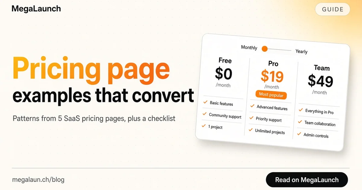
- One highlighted plan. A "most popular" or "recommended" label guides the eye. The middle plan is often highlighted, which uses the decoy effect: a third option changes how the other two are judged.
- Monthly and annual toggle, with the annual saving written as a percentage or in months.
- Plan names that describe the buyer (solo, team, business) rather than abstract names.
- A short list of differences per plan. Five to seven lines per card is enough. "Everything in Pro, plus..." avoids repetition.
- A FAQ under the plans that answers billing, trial, refund and cancellation questions.
- A visible next step on every card: "Start free", "Start trial" or "Talk to sales".
Pricing page checklist for a new SaaS
Use this before you launch or redesign your page:
- The price of every self-serve plan is visible without scrolling on desktop.
- Each plan has one sentence saying who it is for.
- The unit is explicit: per month, per user, per project or per 1,000 requests.
- Taxes and currency are clear for international visitors.
- Trial terms are clear: length, and whether a card is required.
- Limits are written as numbers, not "generous" or "more".
- One plan is highlighted, and it is the plan you want most people on.
- Annual pricing shows the real saving.
- There is a FAQ covering cancellation, refunds, upgrades and downgrades.
- The call to action on each card matches the plan (free signup vs. sales call).
- The page works on mobile: cards stack, the comparison table scrolls.
Common pricing page mistakes
- Hiding the price. "Contact us" on every plan makes small teams leave. Keep it for Enterprise only.
- Too many plans. Five or six tiers force people to compare instead of decide.
- Feature lists nobody understands. Write outcomes and limits in plain words, not internal feature names.
- No free path. For a new product, a free plan or trial removes the biggest barrier to trying it.
- Changing prices without a note. Tell existing customers what happens to their plan.
How to test your pricing page
You do not need heavy tools to improve a pricing page:
- Watch five people use it. Ask them which plan they would choose and why. Confusion shows up fast.
- Track the funnel. Visits to the pricing page, clicks on each plan button, completed signups. Compare plans, not only totals.
- Change one thing at a time. The highlighted plan, the annual discount or the plan names. Run each version long enough to get meaningful numbers.
- Read support questions. Every billing question you get is a missing line on the page.
Your pricing page also works with the rest of the site. The landing page sets expectations, and the pricing page has to confirm them. If you are pre-launch, a simple "pricing coming soon" section with an early-bird offer works well on a coming soon page.
When you launch
On launch day, many visitors go straight from your launch post to your pricing page. Make sure the page is final, the launch offer is visible and the checkout works. If you are launching on MegaLaunch, say in your listing whether there is a free plan or trial, so the right people click through.
Frequently asked questions
What should a SaaS pricing page include?
The price of each self-serve plan, who each plan is for, the billing unit, trial terms, a highlighted plan, a monthly and annual toggle, and a FAQ covering cancellation, refunds and upgrades.
How many plans should a pricing page have?
Three or four self-serve plans are usually enough, plus an Enterprise option if you sell to large companies. More plans make visitors compare instead of decide.
Should I show prices or say contact us?
Show prices for every plan most customers will buy. Keep contact us for Enterprise or custom deals only.
Why highlight one plan?
A highlighted plan guides the eye and makes the choice easier. Highlight the plan you want most customers on, often the middle one.
Sources
 @matthias_mrc
Put it into practice. Launch your product.
A permanent page, a followed link to your site, and makers who vote for what they like.
- Free with a link back to MegaLaunch
- Premium: $14.99 one-time, no backlink needed
Done for you
We submit your product to 100+ dofollow directories.
From one brief, with a report for every directory. No badge needed on your site.


From$99one-time
See the plans